Web Design

Designing a dashboard to handle Multi-Dimensional Data

My Role: Product Designer
Timeline: 2 Months
Team: 1 Product Designer, 2 Business Analyst, 1 Data Analyst, 12 Engineer

Intro to VdoTok's Dashboard

With VdoTok's intelligence dashboard, the user of VdoTok is able to track the usage of applications installed on their device. VdoTok helps the user to track more than 50 different kinds of metrics and allows the user to visualize the data in any way they like. The purpose of making such an intelligence dashboard is to help the users of VdoTok gather data and make intelligent decisions by visualizing them.

Design Process Overview

Problem Overview

At the beginning of the project, I surveyed a few competitors and talked to a few potential users to learn what the users were experiencing within the market. A couple of problems were identified from the resesearch.

#1 HMW presents all the metrics in the dashboard while allowing users to find the information easily?
From the competitor analysis, we found that the statistic page of the dashboard is mixed up with different types of metrics, and the user might not be able to find the information they need easily through the complicated navigation in the dashboard.

#2 HMW design an onboarding experience of the dashboard that allows users to experience the product's value ASAP?
We found that other competitors, such as Twilio, Plivo, or Sinch, require a long onboarding process until the user can set up their account and see the statistics in the dashboard, so the users can never experience the value of using the product until the user commits to install and run the service.hat the users were experiencing within the market.

An example of Cognitive Overload in Twilio's Dashboard

An example of an empty-state dashboard in Twilio

Pitch helps teams build better presentations:
collaboratively, effectively, and beautifully.

VdoTok,

A faster way to build communication platforms. (Aka Zoom, Google Meet)

Want to get early access and product updates?

We care about protecting your data. Here’s our Privacy Policy.
Thank you! Your submission has been received!
Oops! Something went wrong while submitting the form.

Vdotok / web & rwd design

An API platform for creating better zoom & google meet

Brief
VdoTok aims to create a user-friendly platform, that enables anyone to build fully customisable video call software at an affordable price. This is done by allowing developers to embed video call technology in apps and websites within few lines of code.

In this project, I worked along with the CEO, CPO, engineers and marketing manager to design and build the entire platform from scratch.
Role
Product Designer /
VdoTok AB, Stockholm
Timeline
2020 - 2021
Tools Used
Figma
Anima App

So the best solution is:
involve them in the designs

Vdotok / web & rwd design

An API platform that helps developers to add video/audio into their own apps and sites.

VdoTok develops real-time video and audio API for developers. Within a few lines of code, developers can embed video call technology in apps, websites, or anywhere that need a beautiful, custom video chat.

VdoTok aims to create a user-friendly platform, that enable anyone to build a fully customisable video call software in an affordable price.
Role
User Experience
Visual Design
Prototyping
User Testing
Business & Marketing
Project Context
2020 - 2021
Tools Used
Figma
Anima App

Table of contents

01 exploration

02 Define

03 Ideate & Sketches

04 Prototyping

05 Testing

Exploration

Exploring the HMWs

I started the design phase by holding a discussion where colleagues were able to contribute their ideas or solutions for each of the HMWs we came up with. At the end of the session, we also decided on the solutions that we wanted to focus on for the dashboard:

1. Prepare some mock data so that new users can see some data in the dashboard without committing.
2. Use filters to filter out data and let people focus on the important ones.
3. Allowing users to design and customize their own dashboard and graphs.

Brainstorming ideas for each HMWs

Exploring how others present their dashboard

To come up with a dashboard that could differentiate our product from the competitors and deliver the best experience for the users at the same time, I started surveying a few direct/non-direct competitors to check out how they presented their dashboard. After that, I also looked up their customer reviews on G2.com and Trustradius to learn what features customers were seeking.

Example from Plivo

Example from Bandwidth

Example from Twilio

Example from Daily.co

Define

Define what data/metrics we are presenting

As the dashboard involves a lot of technical information, I worked with the Data Analyst within the company to come up with the list of data that we were collecting in the platform and what items from it should be presented to the users.

An initial list of data that everyone came up with

Clustering the data into different levels

Ideate & Sketches

Co-creating the wireframe with data analyst

As the wireframes require a lot of technical knowledge, I decided to work with the Data Analyst to come up with a Wireframe on Microsoft Power BI (The data visualization software that our company used). The data analyst helped me to find the data that would be presented in the final dashboard, and I help to organize it into different categories and layers. As the combination of different data could also reveal different types of information, I also worked with the analyst to find out the potential ways of visualizing the data.

Example page of the dashboard we build together on Microsoft BI

Example page of how much visualized data/information
we would like to present to our users...

Turning the Power-BI wireframes into implementable wireframes

After the data analyst in our team helped me to list out all the potential numbers and charts that will be shown in the dashboard page, I started sketching out some ideas to "fit" all those charts into one single screen.

Sketching out some initial ideas for the prototype

Wireframe for the statistic page

Gathering feedback form team with a higher-fidelity prototype.

Turning the sketches into a higher-fidelity form
so that the team members can provide feedback

Typography

There are two types of fonts that are used for the brand:Manrope and Inter. Both fonts are modern variable fonts -perfect for digital products, website and apps.

Both fonts are carefully chosen to create a high-end product,app and developer friendly feeling and inspired by SF ProDisplay (the main font of Apple).

Colors

Yellow stimulates nerves and brain, making us more alertand energized. Yellow boosts memory and encourages communication. It’s a color that promotes activity and interaction - just as VDO TOK does.

Prototyping

Prototype Design

The first version of the design includes an Overview page, where users can see the main information about their usage in the platform, an Statistic page, where users can find the detail information and data about their usage in the platform, and an session log page, where users can find every session's usage in the platform

Statistic Page - Multiple Filters & Customizable Graphs

To present all the information in a clean way, I designed multiple filter levels to help the user to find the information they need. In addition, to visualize all the data in an efficient way, instead of having the platform defining all the data that the users could see, I decided to provide a permission for the users to combine their own sets of data. This is done by separating the different parameters into X and Y axis, and allowing users to use checkboxes to combine different parameters and visualize them.

Allowing users to use filters and combining different parameters to only show the information they need

Overview Page

As many metrics need to be shown in the dashboard, I broke down the presentation of the metrics into different levels. At the top-most level, users could see the most critical metrics of the API services we provide (i.e., Video, Audio, or Messaging).

The overview page in the first design iteration

Putting detailed information in sub-levels

Users can find more detailed metrics and parameter information of each session in the session log panel. In this page, customers can find detailed information about the performance of each session and each participant through the panel.

Session Log Page

Testing & Improvements

Testing with Engineers & Communities

Despite having a limited budget for conducing user research, I was fortunate to have a huge engineering team in the company that I could test with. Since the target user of this dashboard would also be developers, I conducted a few testing sessions with our own developers to gain their feedback.

Since I am part of the MeetUp Group "TestMyProduct", I also got the chance to show the prototype with a few people online and get some feedback.

Tested the prototype with the engineers and the "Test My Product" group

Improvements

After getting some initial feedback from the team and the community, I got more confidence about the design and improved the design based on the inputs.

Overview Page - Cleaner Interface with Actual Metrics Defined

In the new design, I fixed a couple of issues that I encountered during the testing sessions. First, the service filter (iOS, Android, etc.) shouldn't be there as our service will be limited in the MVP. The second is that I moved the "More" button closer to each section (i.e., Video Sessions, etc.), as I found that people weren't aware of the button while testing it.

A Cleaner Interface with Actual Metrics Defined

Statistic Page - Improved Filters / Groupings

From the testing sessions, I found out that more filters are needed, so I designed three-level filtering in this version. The first level is general information such as Date and Country. The second level is the primary services we provide, Messaging, Video, and Audio. And the last level is the details of sessions, such as platform, version, gender, etc.

Added more levels of filters and added a "Group By" category that helps user to categorize data when visualing it

Demo of how the filtering works

Other Pages

After gaining some first-hand feedback from the testing sessions, I also have more confidence about the design direction and added a few more design pages left out in the previous version in this version.

Implementing an "Example page", where new users can already play with some mock data in the beginning.

Updated Static Page with Filter options

Updated Static Page with Filter options

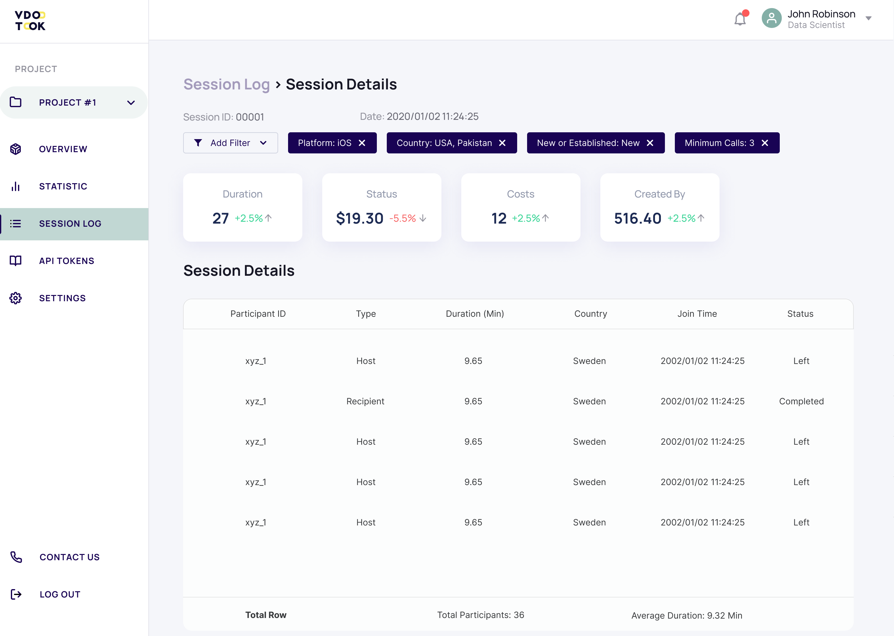
Session Details, show information about who's in the call, how long did they stay, etc.

Participant Details, show information about their connections, device, etc.

Another round of testing with Engineers

Tested the prototype with the engineers in the team

What did I learn?

Break complicated things into little things

As the services that VdoTok provides consists of complicated connection data, initially it was a big headache to present 50+ metrics in a webpage. To soothe this, I first tried to categorize different data into different levels and categories, and then come up with some ideas to visualize the data without taking up too much space.

Work closely with engineers

As the end-users of this product are the developers, I worked closely with the developers in our own company during the design process. This ensured regular feedback from the developers to improve the design.

Learn more about how used a data-driven approach to develop an app with 40% of retention rate

Read Next Case Study